AI Product · Retrospective
Rethinking an AI copilot interface for contact center agents — from the inside out, five years later.

Timeline
2020 – 2022
My role
UI Designer (supporting)
Collaborators
Product · Engineering · Marketing
Platform
Salesforce AppExchange
00 — Context
What this is
From 2020 to 2022, I worked as a junior UI designer at Laivly, contributing to Sidd — an AI copilot for contact center agents. My role was primarily executional: producing design specs, supporting the marketing team with brand illustrations, and shipping screens when the team needed extra hands.
I wasn't in the room for most product decisions. I didn't lead user research or own any feature end-to-end.
What I did have was proximity. I watched the decisions get made, delivered the screens that came out of them, and occasionally disagreed quietly with what I was drawing.
This is a retrospective. It's 2026, the AI landscape has changed completely, and I want to revisit one part of the product I've thought about the most: the Live Call interface. What did we get right, what we didn't, and how I'd approach it today.
01 — The problem
The problem with tabs
A contact center agent is on a call. The customer is talking. The agent is listening, searching for context, and trying to respond — all at the same time.
Meanwhile, the Sidd interface asks them to remember which tab holds the transcript, which one has guidance, and which one opens the case note.
This isn't a design. It's a memory test.
The problem wasn't the icons. The problem was that tabs were the wrong solution from the start.
02 — The diagnosis
Two jobs. One interface.
Being on a call is one thing. Processing the case after the call is another.
These two tasks don't share a time zone. But the original design treated them as if they did — stacking them into the same narrow panel, then using tabs to pretend that was fine.
In-call
Passive awareness
Agent needs to perceive — what did AI surface, what's next. No hunting, no switching. They're on the phone.
After-call
Active work
Agent needs workspace — fill disposition, edit case note, close the ticket. Live AI push is now irrelevant noise.
Split the two modes. Let the interface follow the call state — not the other way around. No manual navigation required. The phone controls the UI.
03 — The redesign
Structure before content
Before deciding what to show, we need to decide what kind of information belongs where.
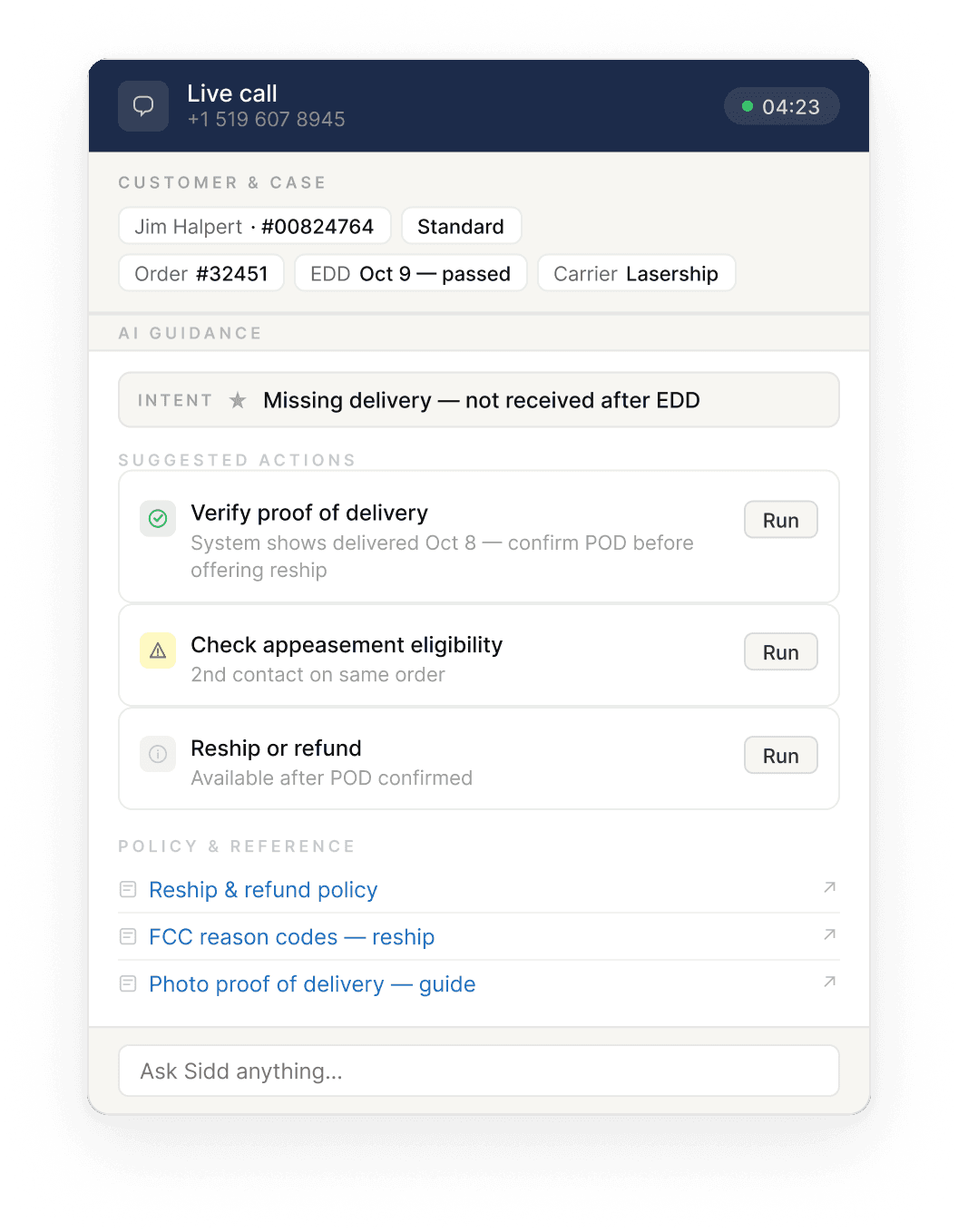
Not all information behaves the same way. Some things are stable facts — customer identity, order number, account tier. Some things are AI inferences — intent, suggested actions — that shift as the conversation evolves. Mixing these two types in the same zone creates confusion. The agent can't tell what's verified and what's a guess.
Anchor zone — the top strip that never moves. Customer name, account ID, relevant order, carrier. These are facts pulled from the CRM at call start. They don't change. When the agent is mid-conversation and needs to confirm something fast, they look up. The answer is always there.
Intent doesn't live here. Intent is inferred. It might be revised three times in a six-minute call. Stable facts and dynamic inferences need to be physically separated — not just visually distinguished.
AI guidance — everything below the anchor. This zone opens with an intent banner: one line, plain language, describing what the AI thinks the customer wants right now. Below that, a short list of suggested actions — no more than three, ordered by priority.
On confidence scores: early versions displayed a percentage alongside AI suggestions — 87%, 91%. The problem was that agents had no reference point. Is 87% high? Should they trust it more than 72%? The number communicated precision without communicating meaning. We removed it. If the AI isn't sure, the interface says so — plainly.
Policy documents and reference links sit at the bottom of the guidance zone, separated from dynamic content. They're static. They don't belong in the same visual layer as real-time AI output.
Wireframe — in-call mode & after-call mode
In-call

After-call

04 — Decisions
The calls that were harder to make
Intent before action. The AI's logic is: infer intent first, then derive actions from it. So the interface should follow the same order — intent banner at the top of the guidance zone, actions below. This sounds obvious in hindsight. In the original design, intent was buried inside one of the tabs, or absent altogether.
Intent doesn't anchor. Early in the redesign, I considered placing inferred intent in the anchor zone alongside the customer and order data. It made spatial sense. But intent is dynamic — it can change three times in a six- minute call as the customer explains more. Stable facts and shifting inferences don't belong in the same zone. Anchoring something that moves undermines the whole premise of the anchor.
Three actions maximum. Miller's Law, applied directly. An agent on a live call can't triage a feed. They need to know what to do next. One primary action — the thing the AI thinks is most urgent right now. Two supporting actions — contextually relevant, not time-critical. Everything else waits, or gets surfaced via the "Ask Sidd" input at the bottom.
Transcript stays off-screen during the call. Real-time transcription was shown to agents in the original design. The reasoning was probably: more information is better. But a fluent agent on a live call doesn't need to read what they're hearing. The transcript's value is in archiving and analysis — not in real-time display. After the call ends, one line: "Transcript saved to case — View in CRM ↗ · Email to customer ↗". Enough.
05 — Reflection
What this is, and what it isn't
This is a 2026 construction, not a shipped product. I haven't run user tests on it. I can't verify that three action cards are always enough for a complex call, or how the intent banner should behave gracefully when the AI changes its mind mid-conversation.
These are real questions that belong in a real validation cycle — with real agents, in a real contact center, on real calls.
But the redesign rests on a premise I do believe is correct, and that the original design violated:
The interface should follow the agent's cognitive state — not ask the agent to track the interface's structure.
In-call and after-call are two different modes of attention. Tabs forced agents to navigate between them manually, at the worst possible moment. Splitting the modes — and letting the call state drive the transition — removes that cost entirely.
Whether this specific layout is the right answer, I don't know. But the question it's answering is the right one.
Currently open to new
opportunities.
Let's build something that works for the workers.
← Back to all work
Evan Zhai