@Laivly · AI Product · Retrospective
Sidd Duo —
Onboarding Under Pressure
Why B2B onboarding keeps failing new users, and what we should have built instead.


Timeline
2020 – 2022
My role
UI Designer (supporting)
Collaborators
Product · Engineer · Marketing
Platform
Salesforce AppExchange
00 — Context
What this is
From 2020 to 2022, I was a junior UI designer at Laivly, working on Sidd — an AI copilot for contact center agents. I shipped screens. I wasn't in the room for most product decisions.
This is a retrospective. The onboarding features I'm writing about were things I helped build, watched get deployed, and quietly noticed weren't working. The redesign is what I'd propose now — with five more years of experience and a clearer sense of why the original assumptions were wrong.
I'm not inflating my role. The value here is in the analysis, not the seniority.
01 — The environment
The environment no one designs for
Before I worked in design, I spent a few months doing data entry at a call center — processing charity donations for the Salvation Army and the Canadian Cancer Society. It was October through January. The holiday season. The phones didn't stop.
Training lasted two days. After that, you were on the floor. Any question you had, you asked the person next to you — if they weren't also on a call. There was no time to step away and read a manual.
When I joined Laivly and started working on Sidd, I recognized the environment immediately. A contact center agent is always doing at least three things at once.
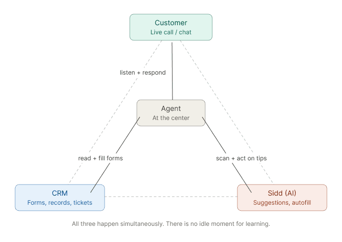
This is the environment onboarding has to work in. Not a quiet session with a training video. A live call, a waiting customer, and a new agent trying to figure out which button oes what.
02 — Three attempts
Three attempts, one wrong assumption
We tried three different approaches to onboarding. Each one failed for a different surface reason — but the same underlying one.
Attempt 01
Training Center
A dedicated module — Resources, FAQ, What's New — accessible from the system tray. Agents could launch guided walkthroughs of each Sidd feature before using it on a real call.
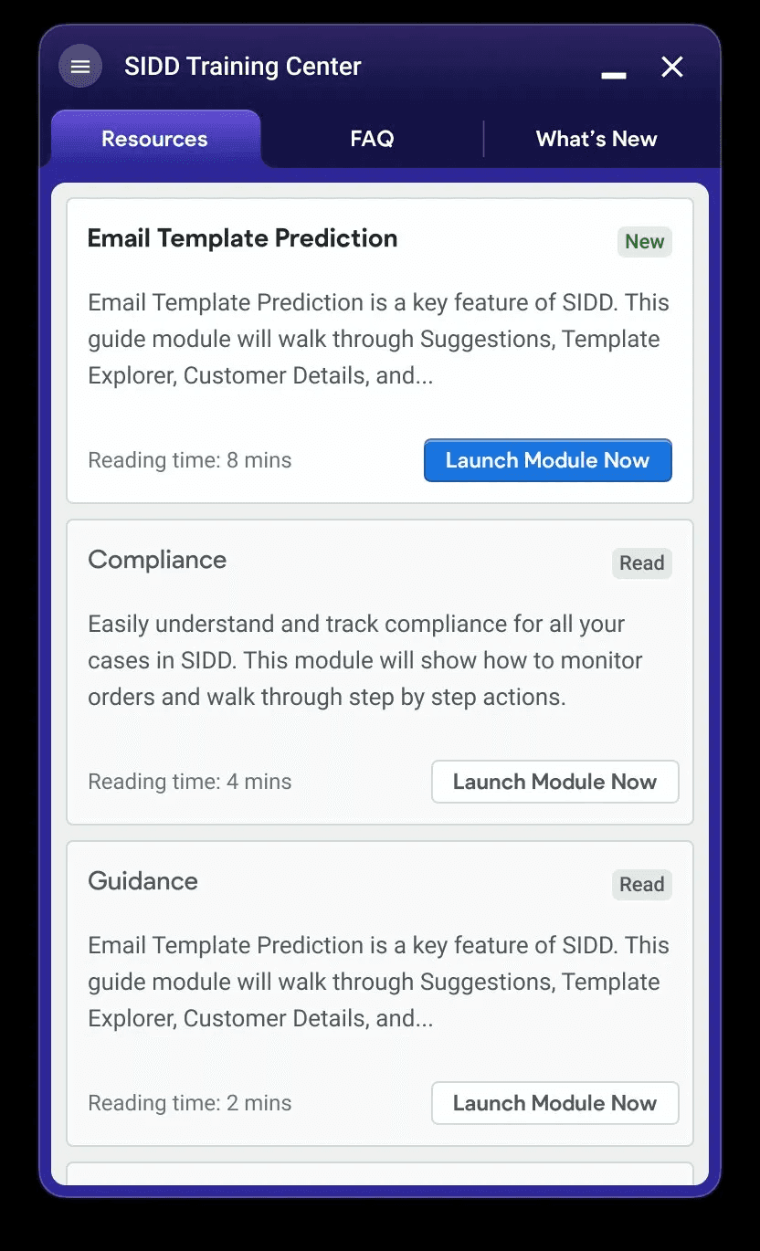
Why it didn't work. Agents had no time to enter a learning mode. In a contact center, there's no idle moment — and in the holiday season, there's barely a bathroom break. The module existed. Nobody used it.
Attempt 02
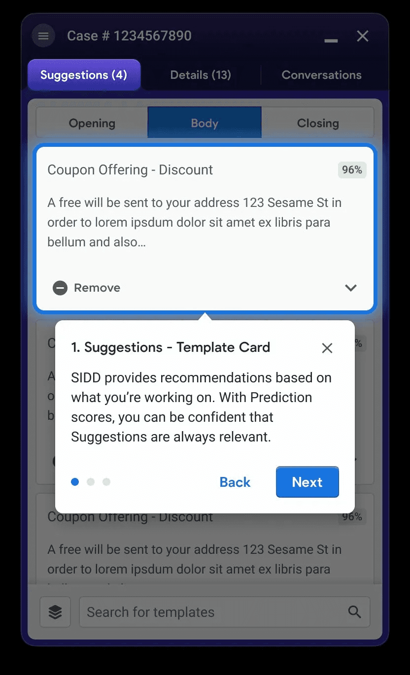
Color-coded field tags
Small inline labels injected into third-party forms — blue for AI-filled, yellow for uncertain, red for manual input required, green for confirmed. Seven variants in total, each with a tooltip on click.
Why it didn't work. Seven colors with overlapping meanings. Blue and green expressed the same thing. Red meant "needs attention" — but agents read it as "error." Color-blind users couldn't distinguish blue from teal. The system required learning before it could help.
Attempt 03
Conversational UX
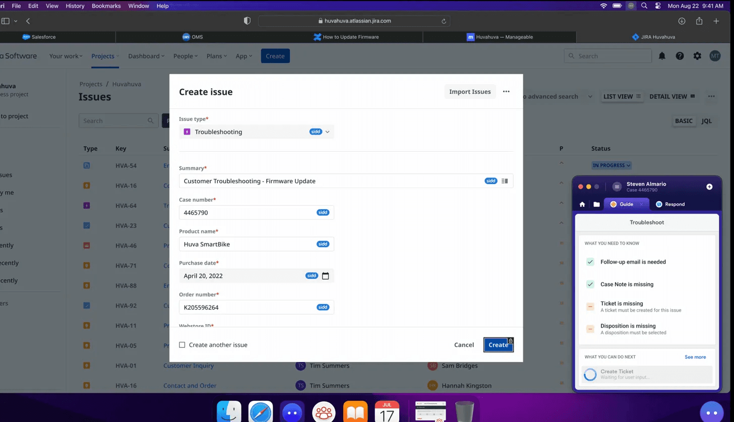
A chat-style interface: "Ask Sidd anything." The agent types a question, Sidd searches the Knowledge base and replies. The logic was: the agent drives, the AI responds.
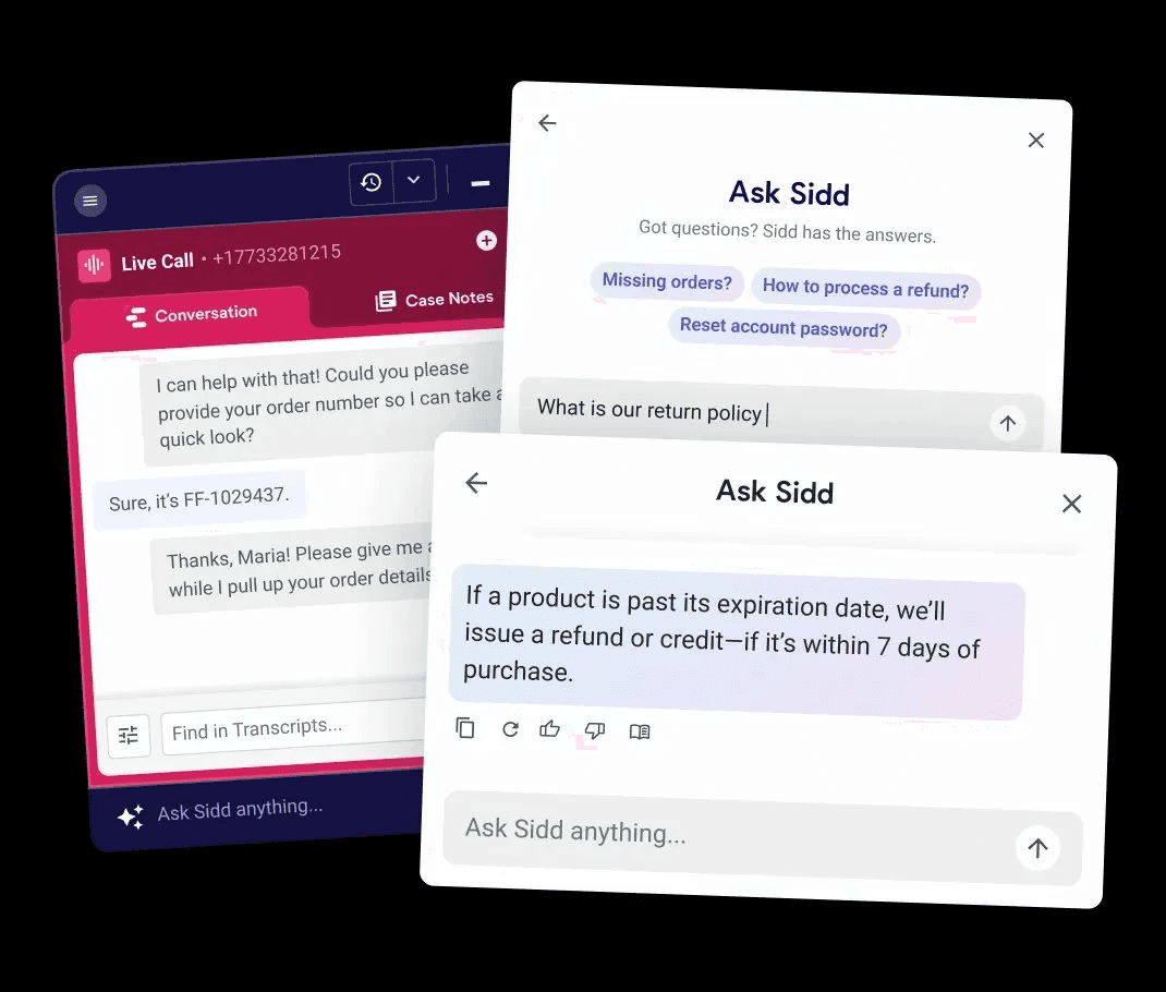
Why it didn't work. On a live call, who's typing? And more fundamentally — a new agent doesn't know what to ask. You can only ask about things you know exist. The interface put the burden of inquiry on the least-informed person in the room.
The shared failure
"Each design assumed a user with more time, more knowledge, and more cognitive capacity than the real agent actually had."
03 — The culture problem
Two phrases that let designers off the hook
These failures weren't just design failures. I heard both of these phrases more than once on the team.
"Once employees complete training, they'll know how to use it."
This moves the problem out of the product and into HR. In practice, training is two days. The edge cases show up on day three.
"We're designing for power users."
This sounds reasonable until you realize that "new user" covers a much wider spectrum than one type of person.
No industry experience
Missing everything — industry norms, tool conventions, customer service instincts.
Industry experience, new company
Missing this company's policies, systems, and escalation paths.
Same company, new tool
Missing how Sidd fits in — what it does, when to trust it, when to override it.
Same company, new project
Missing this brand's specific SOP — different return policy, different tier structure, different tone.
Designing for "power users" means designing for none of these four. The interface needs to work for the least-informed person on shift — not the most senior one.
There's a related habit: designing only the happy path. It's comfortable for teams under deadline. But real shifts aren't happy paths — systems time out, orders have conflicting records, customers change their minds mid-call. If the interface only handles the clean case, it fails users exactly when they need it most.
04 — The principle
Proactive disclosure over progressive disclosure
Progressive disclosure — start simple, let users dig deeper as needed — puts the navigation burden on the user. In a high-pressure environment, that burden doesn't get picked up. Users stay at the surface and make decisions with incomplete information.
The alternative is proactive disclosure. The system doesn't wait to be asked. It structures the relevant information upfront — based on what it already knows about the customer, the order, and the call — and presents it in a form the agent can scan and act on immediately.
The agent's job shifts from "figure out what to ask" to "confirm, correct, or choose." This
maps directly to Nielsen's heuristic: recognition over recall. A new agent who doesn't know what to ask will still recognize a correct suggestion when they see one.
05 — The redesign
Six screens, one complete journey
The redesign traces a single call from start to finish — including a mid-call context shift, a trip into the full action library, and a system error recovery. Each screen is a design decision made concrete.
This is a conceptual redesign, not a shipped product. The goal is to show what onboarding looks like when it's embedded in the work itself.
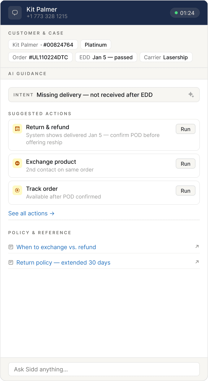
Screen 01
Call starts — proactive briefing
Before the agent needs to act, Sidd surfaces customer facts and three suggested actions. No prompt required. The frame is already built.
Screen 02
Action detail — form in progress
Agent enters a form flow. Sidd mirrors field status in plain language: field (filled), check (verify), TBD (your call). Browser and Sidd remain separate windows — Sidd injects tags only.
Screen 03
Context shift — the list reshuffles
Customer changes their request mid-call. The action list updates via motion — cards dealing out, new ones dealing in. No banner. A small timestamp marks the refresh. The previous recommendation dims but stays accessible.

Screen 04
Full action library
Agent can't find what they need. They open the complete operator-configured action set — searchable, grouped by category, with AI picks pinned at the top.

Screen 05
Return to home — agent pick persists
The action the agent manually selected auto-pins to the home screen with an "Added by you" label. The entry point is never lost. Agent judgment takes priority over AI inference.

Screen 06
Error recovery — the screen that didn't exist
System error during a live call. Sidd answers three questions immediately: why this happened, what the agent can do right now (as runnable action cards), and who to contact. A suggested holding script is included — because knowing what to say to the customer is often harder than finding the solution.
06 — Key decisions
The calls that were harder to make
Field tags
Three states, one word each
The original system had seven color variants with overlapping meanings. The redesign collapses to three: field (Sidd filled this), check (verify), TBD (your call). One word per state, no color dependency, no tooltip required to understand.
Recognition over recall
Consistency with conventions
Accessibility

Context shifts
Motion instead of banners
When the action list updates, the original reflex was an explanatory banner. Banners accumulate fast in a narrow sidebar — they become visual noise. The redesign uses motion instead: cards reshuffling is the signal. A small timestamp is the only annotation.
Visibility of system status
Minimal and aesthetic
Error states
Three questions, answered before they're asked
When a submission fails: why, what next, who to call. All three on the same screen. Options are runnable action cards — not descriptions that require the agent to avigate elsewhere. The original product had no error state design. It was a happy path product.
Help users recover from errors
Help and documentation

Action library
Agent picks outrank AI picks
When an agent manually selects from the library, that choice pins to home above the AI recommendations. The agent's active judgment takes priority. The interface makes that hierarchy visible.
User control and freedom
Flexibility and efficiency

07 — Reflection
What this is, and what it isn't
This is a conceptual redesign. It hasn't been tested with real agents on real shifts. Whether three action cards are always enough, or how the motion handles back-to-back context shifts — those are questions for a real validation cycle.
What I'm more confident in is the underlying principle. Onboarding that lives outside the work — in a training module, in a separate learning mode — won't be used in a high-pressure environment. Not because agents don't want to learn, but because there's no moment available for it.
Effective onboarding in B2B has to be embedded in the task itself. It has to meet users at the moment of need, without asking them to step away, decode a symbol system, or construct the right question from scratch.
"New user" is not a fixed category. It's a moving target with different knowledge gaps, different histories, different blind spots. You can't cover all of them. But if the interface works for the most stressed, least-informed person on shift — it will work for everyone else too.
The interface should meet the user in the work, not ask the user to leave the work to learn the interface.